Blog redesign in progress

March 14th, 2009
screenshot of blog redesign in progress

I’ve started to tire of my blog’s design and have begun to tear it down 1 in order to rebuild. “In LA v2.0” will be wider 2, mostly free of sans-serif fonts 3, with larger images, more whitespace, a redesigned theme and header –and the page will display in 3D 4 if you look at it through polarized glasses.
  1. er, I’m tearing down and rebuilding an auxiliary copy ↩︎
  2. because I refuse to continue to design for 800×600 resolution displays ↩︎
  3. blocks of text with serifs are easier to read by word shape, unless you’re on an OS that doesn’t render them properly :) ↩︎
  4. or at least with 50% less glare ↩︎

Let’s practice rotoscoping!

March 14th, 2009

Given the power of today’s rotoscoping software, anyone can rotoscope –as long as s/he has a sharp eye for detail, unlimited spare time, and no good infomercials are on TV.

Posted via email from Zachary’s posterous

Can you drift-race a Changan delivery truck?

March 11th, 2009

If you’ve never seen a souped-up Changan delivery truck drift around the corners of roads in rural China, you are in for a treat. My jaw dropped around the 4:20 mark. I’ve seen many a Changan truck driven with abandon in China, but never deliberately or with such precision. Towards the end of the video, there’s a look at the driver and the work he’s put into improving and maintaining his Changan, including a glimpse of the undercarriage and disassembled transmission of this widely-used truck.

As someone who one-day hopes to own a souped-up Yugo, I feel a kinship with this Changan driver. Here’s a hypothetical: Would you prefer to watch two Changans drift-race through Hengdian or see an RX7 and BMW drift through Tokyo. For me that’d be a tough call.

Source: shanghaiist. Their source: Chinasmack. Their source: The Official God FAQ.

color matching subsequent shots in a spec commercial

March 10th, 2009

I’m doing color work on a couple of spec commercials today. This screenshot catches me attempting to match the color and luminance of two consecutive shots. Unfortunately the position of the lights was changed when the camera was repositioned closer to the actor, so the shot’s intensity, direction, and the overall color balance changed between the medium-wide and the close-up. When these shots are edited together and played back, the transition doesn’t feel optimally smooth due to the fact that the images don’t match well enough for the viewer’s brain to completely buy into the idea that the action is continuous from one shot to the next. In this screenshot,
 
I’ve captured a still of the wide shot and have overlaid it on the left side of the close-up shot as a split-screen view, to both guage the difference by eye and to see it in the variety of scopes provided by the application, the most useful guage to me for this matching work being the ‘Parade’ visualization at top right.
 
In this instance I’ve already dropped the highlights in the close-up quite a bit. They’re still about 17% brighter than the highlights in the wide shot, but if I darken them further it really drains all the life from the shot. I’m inclined to not match the brightness of the actor’s face exactly from shot to shot but instead to split the difference and just bring down the close-up to the point that it doesn’t jolt the audience at the transition. It’s a subjective art, and I’m enjoying the process; Muddling my way through using my photographic and editorial instincts.

Posted via email from Zachary’s posterous

Old-school meat counter

March 10th, 2009

Romeo, at the M.M. Market on Coldwater Canyon is making me a sandwich right now. He’s behind a pretty cool looking meat counter, decorated with (among other things) photos of himself cutting meats at the same location back at least as far as 1972.
 
It’s probably a sign of the times that I’ve lived walking distance from this place for over a year and never stopped by –Also a sign of the times that I finally decided to check it out after seeing someone post about it on Twitter.

Posted via email from Zachary’s posterous

The unsafe have more fun

March 8th, 2009

Don’t the unsafe pair on the right appear to be having a better time?

Posted via email from Zachary’s posterous

Hanging with Mickey

March 8th, 2009

Or is that Minnie? Which one’s the orange, saliva-drenched one again?

Posted via email from Zachary’s posterous

random meanderings

March 7th, 2009

A moment of boredom became one of inspiration, and I began executing a few google searches for made-up words, some made up by me, some by others, and some just the result of random mashing on the keyboard. The internet being the large mammal that it is, there were many happy returns:

Galumph
Suzhou Galumph Machinery Co., LTD.,”…the standard bright rich special casting limited companyis by the nodular graphite casting primarily”
Borogove
Borogove Coffee
Mome
Mome,”… quarterly anthology showcasing the best new talent of this decade’s rising cartoon generation…”
Woin
woin woin,”A word that was initally used to mean complaining or abusing in a game of DotA on Warcraft 3…”
ASDF
ASDF,”Association of Synchronous Data Formats, Alabama State Defense Force, Alaska State Defense Force…”
Wonf
WONF, “With Other Natural Flavors, W.O.N.F.’s can be a method of obtaining the best value in natural flavors. Direct concentrates of some of the more delicate or subtle flavors like Blueberry, Strawberry or Raspberry can get quite expensive and require special handling. W.O.N.F.’s on the other hand allow you to obtain a naturally stronger flavor without the use of artificial enhancers, providing you with the luxury of “All Natural” in flavoring your product.”
znlg
znlg.com, this one appears to be a Chinese pharmaceutical company.

Well, that was an amusing diversion for a few minutes. Now back to work.

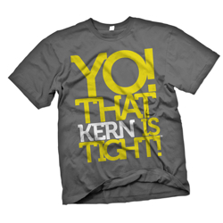
Yo! That Kern is Tight! T-shirt

March 7th, 2009
 Media 7894 O Kerngreylarge
I’m sorely tempted to buy this T-shirt, though I wonder if all the people who are geeky enough about typography to find it funny either already have the shirt or have already seen it. I suppose I’m not helping keep it a secret by posting it here, but neither would I be by wearing it. I guess a T-shirt can only be both unique and funny for a while, and then just remains funny. So it goes.

Nice work, Workerman 1.

  1. designer and purveyor of this t-shirt ↩︎

coloring spec commercials

March 6th, 2009

I’m doing a bit of freelance color work on a friend‘s spec commercials. One commercial in particular uses color and black & white to tell a story. I am very much enjoying how good the footage looks once converted to black & white. If you’ve ever shot black & white film through colored filters, you’ll understand how much I enjoy selectively altering the contrast by changing the color mix used to create the black & white image. Fun stuff.

See the full gallery on posterous

Posted via email from Zachary’s posterous